
With Blade components and Tailwind, we can create great components in Laravel quickly. And there are also pre-built UI component libraries! This post will show four of them.
Flowbite
To use styles from Flowbite, you can copy the classes from the Flowbite docs.
Some components like dropdown or tooltip need Flowbite’s JavaScript file. First, you need to install it via npm:
npm install -D flowbiteNext, add it to a plugin in tailwind.config.js.
import defaultTheme from 'tailwindcss/defaultTheme';import forms from '@tailwindcss/forms'; /** @type {import('tailwindcss').Config} */export default { content: [ './vendor/laravel/framework/src/Illuminate/Pagination/resources/views/*.blade.php', './storage/framework/views/*.php', './resources/views/**/*.blade.php', './node_modules/flowbite/**/*.js' ], theme: { extend: { fontFamily: { sans: ['Figtree', ...defaultTheme.fontFamily.sans], }, }, }, plugins: [ forms, require('flowbite/plugin') ],};And last import in the resources/js/app.js
import './bootstrap'; import Alpine from 'alpinejs'; window.Alpine = Alpine; Alpine.start(); import 'flowbite'; For example, we can change Breeze component classes from the Flowbite.
resources/views/components/text-input.blade.php:
@props(['disabled' => false]) <input {{ $disabled ? 'disabled' : '' }} {!! $attributes->merge(['class' => 'border-gray-300 dark:border-gray-700 dark:bg-gray-900 dark:text-gray-300 focus:border-indigo-500 dark:focus:border-indigo-600 focus:ring-indigo-500 dark:focus:ring-indigo-600 rounded-md shadow-sm']) !!}> <input {{ $disabled ? 'disabled' : '' }} {!! $attributes->merge(['class' => 'bg-gray-50 border border-gray-300 text-gray-900 text-sm rounded-lg focus:ring-blue-500 focus:border-blue-500 block w-full p-2.5 dark:bg-gray-700 dark:border-gray-600 dark:placeholder-gray-400 dark:text-white dark:focus:ring-blue-500 dark:focus:border-blue-500']) !!}> resources/views/components/input-label.blade.php:
@props(['value']) <label {{ $attributes->merge(['class' => 'block font-medium text-sm text-gray-700 dark:text-gray-300']) }}> <label {{ $attributes->merge(['class' => 'block mb-2 text-sm font-medium text-gray-900 dark:text-white']) }}> {{ $value ?? $slot }}</label>resources/views/components/primary-button.blade.php:
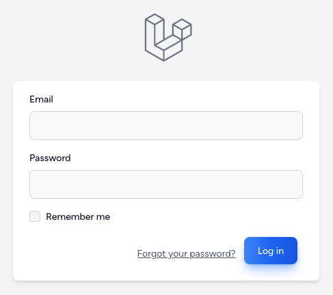
<button {{ $attributes->merge(['type' => 'submit', 'class' => 'inline-flex items-center px-4 py-2 bg-gray-800 dark:bg-gray-200 border border-transparent rounded-md font-semibold text-xs text-white dark:text-gray-800 uppercase tracking-widest hover:bg-gray-700 dark:hover:bg-white focus:bg-gray-700 dark:focus:bg-white active:bg-gray-900 dark:active:bg-gray-300 focus:outline-none focus:ring-2 focus:ring-indigo-500 focus:ring-offset-2 dark:focus:ring-offset-gray-800 transition ease-in-out duration-150']) }}> <button {{ $attributes->merge(['type' => 'submit', 'class' => 'text-white bg-gradient-to-r from-blue-500 via-blue-600 to-blue-700 hover:bg-gradient-to-br focus:ring-4 focus:outline-none focus:ring-blue-300 dark:focus:ring-blue-800 shadow-lg shadow-blue-500/50 dark:shadow-lg dark:shadow-blue-800/80 font-medium rounded-lg text-sm px-5 py-2.5 text-center mr-2 mb-2']) }}> {{ $slot }}</button>We have form styled similarly to the image below:
You can find components in their official documentation.
daisyUI
daisyUI adds class names similar to Bootstrap. For example, btn btn-outline btn-primary will give styles for buttons.
To use daisyUI, you must install it via npm and add it to a tailwind.config.js.
npm i -D daisyui@latestimport defaultTheme from 'tailwindcss/defaultTheme';import forms from '@tailwindcss/forms'; /** @type {import('tailwindcss').Config} */export default { content: [ './vendor/laravel/framework/src/Illuminate/Pagination/resources/views/*.blade.php', './storage/framework/views/*.php', './resources/views/**/*.blade.php', ], theme: { extend: { fontFamily: { sans: ['Figtree', ...defaultTheme.fontFamily.sans], }, }, }, plugins: [ forms, require('daisyui') // [tl! ++] ],};We can change Breeze Blade components classes to have styles provided by daisyUI.
resources/views/components/text-input.blade.php:
@props(['disabled' => false]) <input {{ $disabled ? 'disabled' : '' }} {!! $attributes->merge(['class' => 'border-gray-300 dark:border-gray-700 dark:bg-gray-900 dark:text-gray-300 focus:border-indigo-500 dark:focus:border-indigo-600 focus:ring-indigo-500 dark:focus:ring-indigo-600 rounded-md shadow-sm']) !!}> <input {{ $disabled ? 'disabled' : '' }} {!! $attributes->merge(['class' => 'input input-bordered w-full']) !!}> resources/views/components/input-label.blade.php:
@props(['value']) <label {{ $attributes->merge(['class' => 'block font-medium text-sm text-gray-700 dark:text-gray-300']) }}> <label class="label"> {{ $value ?? $slot }} <span class="label-text">{{ $value ?? $slot }}</span> </label>resources/views/components/primary-button.blade.php:
<button {{ $attributes->merge(['type' => 'submit', 'class' => 'inline-flex items-center px-4 py-2 bg-gray-800 dark:bg-gray-200 border border-transparent rounded-md font-semibold text-xs text-white dark:text-gray-800 uppercase tracking-widest hover:bg-gray-700 dark:hover:bg-white focus:bg-gray-700 dark:focus:bg-white active:bg-gray-900 dark:active:bg-gray-300 focus:outline-none focus:ring-2 focus:ring-indigo-500 focus:ring-offset-2 dark:focus:ring-offset-gray-800 transition ease-in-out duration-150']) }}> <button {{ $attributes->merge(['type' => 'submit', 'class' => 'btn btn-outline btn-primary']) }}> {{ $slot }}</button>Checkbox has no Blade component, so you need to create one or modify classes directly.
resources/views/auth/login.blade.php
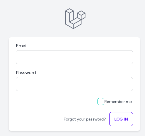
// ... <!-- Remember Me --><div class="block mt-4"> <label for="remember_me" class="inline-flex items-center"> <input id="remember_me" type="checkbox" class="rounded dark:bg-gray-900 border-gray-300 dark:border-gray-700 text-indigo-600 shadow-sm focus:ring-indigo-500 dark:focus:ring-indigo-600 dark:focus:ring-offset-gray-800" name="remember"> <span class="ml-2 text-sm text-gray-600 dark:text-gray-400">{{ __('Remember me') }}</span> </label> <label class="cursor-pointer label"> <input type="checkbox" checked="checked" class="checkbox checkbox-success" /> <span class="label-text">{{ __('Remember me') }}</span> </label> </div> // ...After changing classes, we have results similar to the image below:
You can find components in their official documentation.
Preline
Preline gives style classes for your components. To use it first, we need to install it via npm:
npm install prelineAdd the path to Preline UI JavaScript files in your tailwind.config.js file.
import defaultTheme from 'tailwindcss/defaultTheme';import forms from '@tailwindcss/forms'; /** @type {import('tailwindcss').Config} */export default { content: [ './vendor/laravel/framework/src/Illuminate/Pagination/resources/views/*.blade.php', './storage/framework/views/*.php', './resources/views/**/*.blade.php', 'node_modules/preline/dist/*.js', ], theme: { extend: { fontFamily: { sans: ['Figtree', ...defaultTheme.fontFamily.sans], }, }, }, plugins: [ forms, require('preline/plugin'), ],};And add the Preline UI JavaScript in resources/js/app.js
import './bootstrap'; import Alpine from 'alpinejs'; window.Alpine = Alpine; Alpine.start(); import('preline') We can change Breeze Blade components classes to have styles provided by Preline.
resources/views/components/text-input.blade.php:
@props(['disabled' => false]) <input {{ $disabled ? 'disabled' : '' }} {!! $attributes->merge(['class' => 'border-gray-300 dark:border-gray-700 dark:bg-gray-900 dark:text-gray-300 focus:border-indigo-500 dark:focus:border-indigo-600 focus:ring-indigo-500 dark:focus:ring-indigo-600 rounded-md shadow-sm']) !!}> <input {{ $disabled ? 'disabled' : '' }} {!! $attributes->merge(['class' => 'py-3 px-4 block w-full border-gray-200 rounded-md text-sm focus:border-blue-500 focus:ring-blue-500 dark:bg-slate-900 dark:border-gray-700 dark:text-gray-400']) !!}> resources/views/components/input-label.blade.php:
@props(['value']) <label {{ $attributes->merge(['class' => 'block font-medium text-sm text-gray-700 dark:text-gray-300']) }}> <label {{ $attributes->merge(['class' => 'block text-sm font-medium mb-2 dark:text-white']) }}> {{ $value ?? $slot }}</label>resources/views/components/primary-button.blade.php:
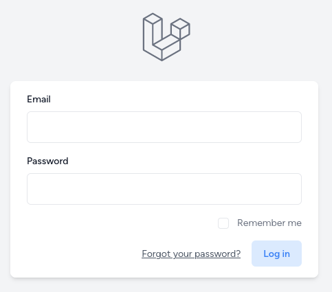
<button {{ $attributes->merge(['type' => 'submit', 'class' => 'inline-flex items-center px-4 py-2 bg-gray-800 dark:bg-gray-200 border border-transparent rounded-md font-semibold text-xs text-white dark:text-gray-800 uppercase tracking-widest hover:bg-gray-700 dark:hover:bg-white focus:bg-gray-700 dark:focus:bg-white active:bg-gray-900 dark:active:bg-gray-300 focus:outline-none focus:ring-2 focus:ring-indigo-500 focus:ring-offset-2 dark:focus:ring-offset-gray-800 transition ease-in-out duration-150']) }}> <button {{ $attributes->merge(['type' => 'submit', 'class' => 'py-3 px-4 inline-flex justify-center items-center gap-2 rounded-md bg-indigo-100 border border-transparent font-semibold text-indigo-500 hover:text-white hover:bg-indigo-100 focus:outline-none focus:ring-2 ring-offset-white focus:ring-indigo-500 focus:ring-offset-2 transition-all text-sm dark:focus:ring-offset-gray-800']) }}> {{ $slot }}</button>After changing classes, we have results similar to the image below:
Preline also has page examples and plugins.
You can find components in their official documentation.
Mary
Mary is made for Livewire and uses daisyUI to style Blade components.
On a fresh Laravel project, you can install Mary via composer and run the install command.
composer require robsontenorio/maryphp artisan mary:installIf you want to install it in an existing project, refer to the manual section in the documentation.
We can replace Breeze Blade components with those from Mary.
resources/views/auth/login.blade.php:
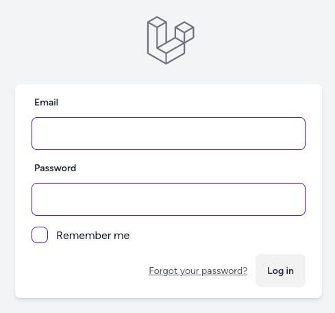
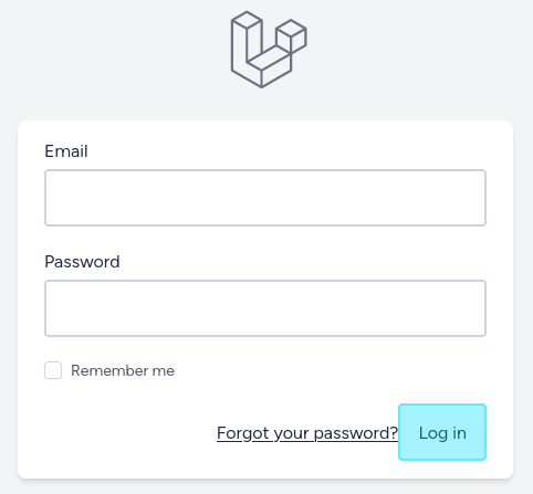
<x-guest-layout> <!-- Session Status --> <x-auth-session-status class="mb-4" :status="session('status')" /> <form method="POST" action="{{ route('login') }}"> @csrf <!-- Email Address --> <div> <x-input-label for="email" :value="__('Email')" /> <x-text-input id="email" class="block mt-1 w-full" type="email" name="email" :value="old('email')" required autofocus autocomplete="username" /> <x-input label="Email" type="email" /> <x-input-error :messages="$errors->get('email')" class="mt-2" /> </div> <!-- Password --> <div class="mt-4"> <x-input-label for="password" :value="__('Password')" /> <x-text-input id="password" class="block mt-1 w-full" type="password" name="password" required autocomplete="current-password" /> <x-input label="Password" type="password" /> <x-input-error :messages="$errors->get('password')" class="mt-2" /> </div> <!-- Remember Me --> <div class="block mt-4"> <label for="remember_me" class="inline-flex items-center"> <input id="remember_me" type="checkbox" class="rounded dark:bg-gray-900 border-gray-300 dark:border-gray-700 text-indigo-600 shadow-sm focus:ring-indigo-500 dark:focus:ring-indigo-600 dark:focus:ring-offset-gray-800" name="remember"> <span class="ml-2 text-sm text-gray-600 dark:text-gray-400">{{ __('Remember me') }}</span> </label> <x-checkbox label="Remember me" /> </div> <div class="flex items-center justify-end mt-4"> @if (Route::has('password.request')) <a class="underline text-sm text-gray-600 dark:text-gray-400 hover:text-gray-900 dark:hover:text-gray-100 rounded-md focus:outline-none focus:ring-2 focus:ring-offset-2 focus:ring-indigo-500 dark:focus:ring-offset-gray-800" href="{{ route('password.request') }}"> {{ __('Forgot your password?') }} </a> @endif <x-primary-button class="ml-3"> {{ __('Log in') }} </x-primary-button> <x-button label="Log in" /> </div> </form></x-guest-layout>After making changes, we have a form using Blade components from Mary.
You can find components in their official documentation.
TurbineUI
TurbineUI is a Laravel Blade & Tailwind CSS UI Component Library. We can install TurbineUI via composer:
composer require brandymedia/turbine-ui-coreThen, we must update the tailwind.config.js content section.
tailwind.config.js:
// ...export default { content: [ './vendor/laravel/framework/src/Illuminate/Pagination/resources/views/*.blade.php', './storage/framework/views/*.php', './resources/views/**/*.blade.php', './vendor/brandymedia/turbine-ui-core/**/*.php', ], // ...};We can replace Breeze Blade components with those from TurbineUI.
<x-guest-layout> <!-- Session Status --> <x-auth-session-status class="mb-4" :status="session('status')" /> <form method="POST" action="{{ route('login') }}"> @csrf <!-- Email Address --> <div> <x-input-label for="email" :value="__('Email')" /> <x-text-input id="email" class="block w-full mt-1" type="email" name="email" :value="old('email')" required autofocus autocomplete="username" /> <x-turbine-ui-input :label="__('Email')" id="email" type="email" name="email" :value="old('email')" required autofocus autocomplete="username" /> <x-input-error :messages="$errors->get('email')" class="mt-2" /> </div> <!-- Password --> <div class="mt-4"> <x-input-label for="password" :value="__('Password')" /> <x-text-input id="password" class="block w-full mt-1" type="password" name="password" required autocomplete="current-password" /> <x-turbine-ui-input :label="__('Password')" id="email" type="password" name="password" autocomplete="current-password" /> <x-input-error :messages="$errors->get('password')" class="mt-2" /> </div> <!-- Remember Me --> <div class="block mt-4"> <label for="remember_me" class="inline-flex items-center"> <input id="remember_me" type="checkbox" class="text-indigo-600 border-gray-300 rounded shadow-sm focus:ring-indigo-500" name="remember"> <span class="text-sm text-gray-600 ms-2">{{ __('Remember me') }}</span> </label> </div> <div class="flex items-center justify-end mt-4"> @if (Route::has('password.request')) <a class="text-sm text-gray-600 underline rounded-md hover:text-gray-900 focus:outline-none focus:ring-2 focus:ring-offset-2 focus:ring-indigo-500" href="{{ route('password.request') }}"> {{ __('Forgot your password?') }} </a> <x-turbine-ui-link href="{{ route('password.request') }}">{{ __('Forgot your password?') }}</x-turbine-ui-link> @endif <x-primary-button class="ms-3"> {{ __('Log in') }} </x-primary-button> <x-turbine-ui-button variant="primary"> {{ __('Log in') }} </x-turbine-ui-button> </div> </form></x-guest-layout>After making changes, we have a form using Blade components from Mary.
You can find components in their official documentation.
Know More Libraries?
That's a wrap for now. If you know other good UI libraries for Laravel, add them in the comments.
For Mary example you can even remove "x-input-error" because this is built-in on all input component types
https://livewire-wireui.com/ https://tallstackui.com/
nice
I highly recommend https://bladewindui.com/
Great. Thanks