
Currently, our form layout is straightforward - one field per line. It takes a lot of horizontal space. Why can't we fit a few fields in one row?
For that, we will use the Card component from Shadcn.
How Card is Used in Starter Kit
This lesson is an example of how to analyze already-existing starter kit components and generate ideas.
Auth screens have three layouts to choose from:
-
layouts/auth/auth-simple-layout.tsx(the default) -
layouts/auth/auth-card-layout.tsx -
layouts/auth/auth-split-layout.tsx
You can try changing it in the auth-layout.tsx file. For this example, we will use the auth-card-layout.
resources/js/layouts/auth-layout.tsx:
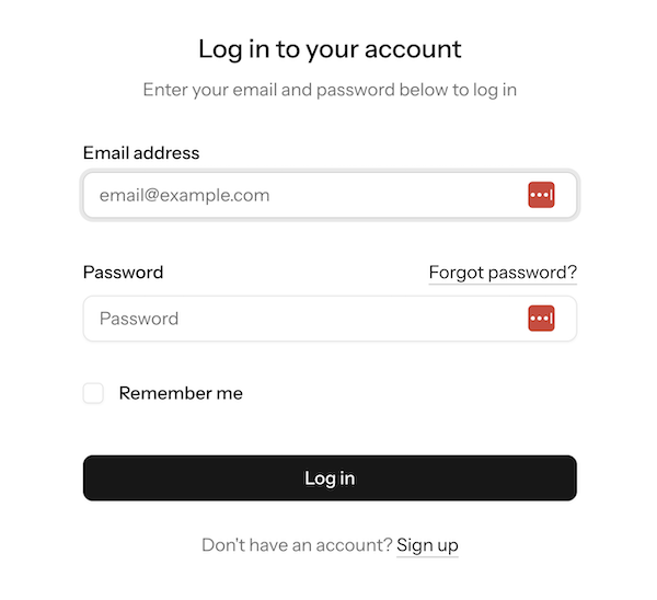
import AuthLayoutTemplate from '@/layouts/auth/auth-simple-layout'; import AuthLayoutTemplate from '@/layouts/auth/auth-card-layout'; This is the Login form with the default auth-simple-layout.
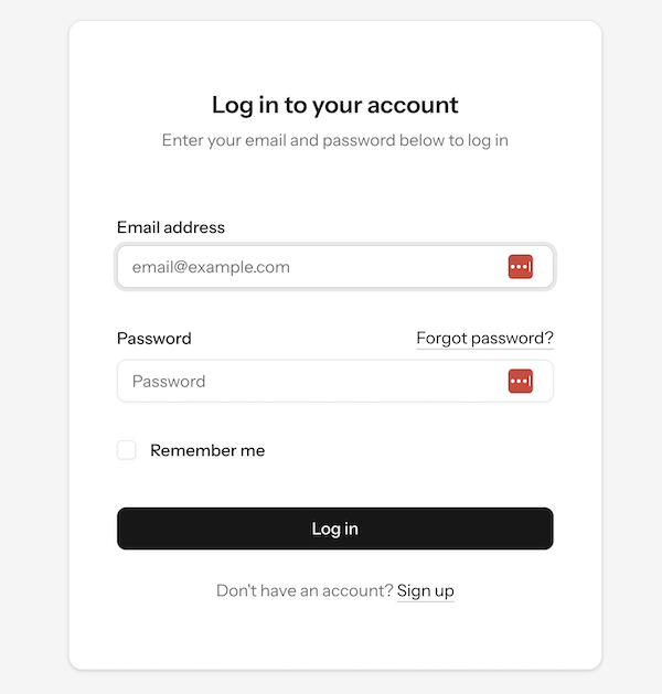
And this is the form with the Card, powered by the auth-card-layout.
Inside that auth-card-layout, we may find the...
No comments yet…