In this lesson, we will add two more pages: "About" and "Contact".
Of course, we could use File -> Save as in the IDE and change text where needed, but this would make a lot of duplicate code, and changing something in the future would require changing every file.
Instead, we need to create a main layout and extend it on every individual page. Layouts can be created in two ways:
- With Blade components
- Or, with layouts inheritance.
This is a personal preference, but in this course, we will use the second option, layouts inheritance. Mainly to get to the result quicker and to avoid explaining another new term of Blade components. My course goal is usually to help get students to the actual practical result as soon as possible.
Main Layout and First Page
First, we must create a View file: a main layout. It will go inside the resources/views/layouts folder (but you can place it wherever you want inside the resources/views) and be called app.blade.php.
In the layout, we only need to add parts of the template that must be reused on every page. In our case, it's these elements:
- Everything in the
headtag - JavaScript files
- Navigation with header and footer
And then, instead of placing the page content in the layout, we must use the @yield Blade directive and give that section a name. That name will be used on every page within the @section Blade directive. So, the main layout would look like this:
resources/views/layouts/app.blade.php:
<!DOCTYPE html><html lang="en"> <head> <meta charset="utf-8" /> <meta name="viewport" content="width=device-width, initial-scale=1, shrink-to-fit=no" /> <meta name="description" content="" /> <meta name="author" content="" /> <title>Blog Home - Start Bootstrap Template</title> <!-- Favicon--> <link rel="icon" type="image/x-icon" href="assets/favicon.ico" /> <!-- Core theme CSS (includes Bootstrap)--> <link href="{{ asset('css/styles.css') }}" rel="stylesheet" /> </head> <body> <!-- Responsive navbar--> <nav class="navbar navbar-expand-lg navbar-dark bg-dark"> <div class="container"> <a class="navbar-brand" href="#!">Start Bootstrap</a> <button class="navbar-toggler" type="button" data-bs-toggle="collapse" data-bs-target="#navbarSupportedContent" aria-controls="navbarSupportedContent" aria-expanded="false" aria-label="Toggle navigation"><span class="navbar-toggler-icon"></span></button> <div class="collapse navbar-collapse" id="navbarSupportedContent"> <ul class="navbar-nav ms-auto mb-2 mb-lg-0"> <li class="nav-item"><a class="nav-link" href="#">Home</a></li> <li class="nav-item"><a class="nav-link" href="#!">About</a></li> <li class="nav-item"><a class="nav-link" href="#!">Contact</a></li> <li class="nav-item"><a class="nav-link active" aria-current="page" href="#">Blog</a></li> </ul> </div> </div> </nav> @yield('content') <!-- Footer--> <footer class="py-5 bg-dark"> <div class="container"><p class="m-0 text-center text-white">Copyright © Your Website 2023</p></div> </footer> <!-- Bootstrap core JS--> <script src="https://cdn.jsdelivr.net/npm/bootstrap@5.2.3/dist/js/bootstrap.bundle.min.js"></script> <!-- Core theme JS--> <script src="{{ asset('js/scripts.js') }}"></script> </body></html>Then, we extend this layout in every individual page, placing the actual content inside the @section block. With that, we don't need to repeat all the HTML tags and navigation with the footer.
To extend the main layout, we use the @extends Blade directive at the start of the View file and provide where the layout is.
resources/views/home.blade.php:
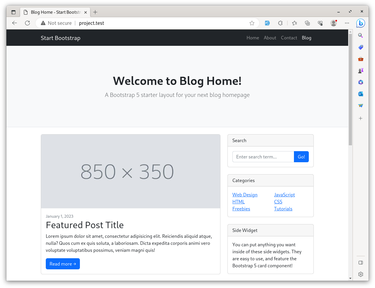
<!DOCTYPE html> <html lang="en"> <head> <meta charset="utf-8" /> <meta name="viewport" content="width=device-width, initial-scale=1, shrink-to-fit=no" /> <meta name="description" content="" /> <meta name="author" content="" /> <title>Blog Home - Start Bootstrap Template</title> <!-- Favicon--> <link rel="icon" type="image/x-icon" href="assets/favicon.ico" /> <!-- Core theme CSS (includes Bootstrap)--> <link href="{{ asset('css/styles.css') }}" rel="stylesheet" /> </head> <body> <!-- Responsive navbar--> <nav class="navbar navbar-secondexpand-lg navbar-dark bg-dark"> <div class="container"> <a class="navbar-brand" href="#!">Start Bootstrap</a> <button class="navbar-toggler" type="button" data-bs-toggle="collapse" data-bs-target="#navbarSupportedContent" aria-controls="navbarSupportedContent" aria-expanded="false" aria-label="Toggle navigation"><span class="navbar-toggler-icon"></span></button> <div class="collapse navbar-collapse" id="navbarSupportedContent"> <ul class="navbar-nav ms-auto mb-2 mb-lg-0"> <li class="nav-item"><a class="nav-link" href="#">Home</a></li> <li class="nav-item"><a class="nav-link" href="#!">About</a></li> <li class="nav-item"><a class="nav-link" href="#!">Contact</a></li> <li class="nav-item"><a class="nav-link active" aria-current="page" href="#">Blog</a></li> </ul> </div> </div> </nav> @extends('layouts.app') @section('content') // The content of the page goes here... <!-- <footer class="py-5 bg-dark"> <div class="container"><p class="m-0 text-center text-white">Copyright © Your Website 2023</p></div> </footer> <!-- Bootstrap core JS--> <script src="https://cdn.jsdelivr.net/npm/bootstrap@5.2.3/dist/js/bootstrap.bundle.min.js"></script> <!-- Core theme JS--> <script src="{{ asset('js/scripts.js') }}"></script> </body></html> @endsection After refreshing the home page, it should look the same.
Two More Pages: Contact and About
Now, let's create two new pages. First, create two new View files for each page and extend the main layout.
resources/views/contact.blade.php:
@extends('layouts.app') @section('content') <!-- Page header with logo and tagline--> <header class="py-5 bg-light border-bottom mb-4"> <div class="container"> <div class="text-center my-5"> <h1 class="fw-bolder">Contact us</h1> </div> </div> </header> <!-- Page content--> <div class="container mb-4"> <div class="row"> <!-- Blog entries--> <div class="col-lg-12"> <p class="lead mb-0">Contact us text</p> </div> </div> </div>@endsectionresources/views/about.blade.php:
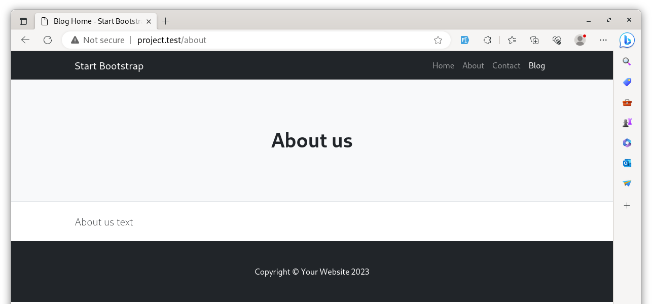
@extends('layouts.app') @section('content') <!-- Page header with logo and tagline--> <header class="py-5 bg-light border-bottom mb-4"> <div class="container"> <div class="text-center my-5"> <h1 class="fw-bolder">About us</h1> </div> </div> </header> <!-- Page content--> <div class="container mb-4"> <div class="row"> <!-- Blog entries--> <div class="col-lg-12"> <p class="lead mb-0">About us text</p> </div> </div> </div>@endsectionNext, we need Routes. In this case, we only show static View files without more logic, so we can use Route::view() instead of Route::get().
routes/web.php:
Route::get('/', function () { return view('home');});Route::view('/', 'home'); Route::view('contact', 'contact');Route::view('about', 'about');You should see a corresponding page after visiting /contact or /about.
Menu Navigation
Now, we should make these pages accessible via navigation.
First, we should add names to the Routes. It's a good practice: when using names, if the URL is changed in the future, you won't need to change the URL on every file where it was used. Instead, after changing only in the Routes file, everywhere else, it will change automatically.
routes/web.php:
Route::view('/', 'home')->name('home');Route::view('contact', 'contact')->name('contact');Route::view('about', 'about')->name('about');In the main layout, where the navigation is, we can use these Route names within the Laravel helper route().
resources/views/layouts/app.blade.php:
// ...<nav class="navbar navbar-expand-lg navbar-dark bg-dark"> <div class="container"> <a class="navbar-brand" href="#!">Start Bootstrap</a> <button class="navbar-toggler" type="button" data-bs-toggle="collapse" data-bs-target="#navbarSupportedContent" aria-controls="navbarSupportedContent" aria-expanded="false" aria-label="Toggle navigation"><span class="navbar-toggler-icon"></span></button> <div class="collapse navbar-collapse" id="navbarSupportedContent"> <ul class="navbar-nav ms-auto mb-2 mb-lg-0"> <li class="nav-item"><a class="nav-link" href="#">Home</a></li> <li class="nav-item"><a class="nav-link" href="#!">About</a></li> <li class="nav-item"><a class="nav-link" href="#!">Contact</a></li> <li class="nav-item"><a class="nav-link" href="{{ route('home') }}">Home</a></li> <li class="nav-item"><a class="nav-link" href="{{ route('about') }}">About</a></li> <li class="nav-item"><a class="nav-link" href="{{ route('contact') }}">Contact</a></li> <li class="nav-item"><a class="nav-link active" aria-current="page" href="#">Blog</a></li> </ul> </div> </div></nav> // ...The navigation now works; we can click the links and go to three pages with different content!
There it says: "After refreshing the home page, it should look the same.". Hm, no. The section content is => // The content of the page goes here...
this is what i see, not the downloaded bootstrap/template content.
If this happened, there is an issue with the layout template. Check that and make sure it is correct
bro you might coppied all of the contents of the home file to app file. Consider rereading the code.