
Text Version of the Lesson
If you want to change the appearance of Filament panel designs, there are small things you can change easily, and creating your own themes is possible. Let's explore the possibilities.
Changing colors
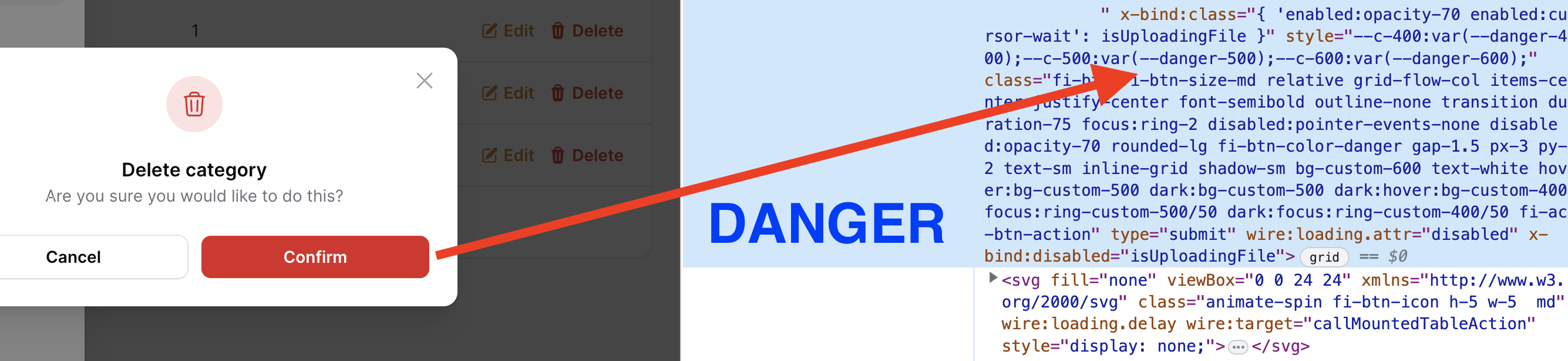
All the colors of all elements you see on the Filament pages are taken from the list of six colors. Each has its name and default values:
- primary (amber)
- success (emerald)
- info (blue)
- warning (orange)
- danger (rose)
- gray (gray)
You can see those names being used in various components:
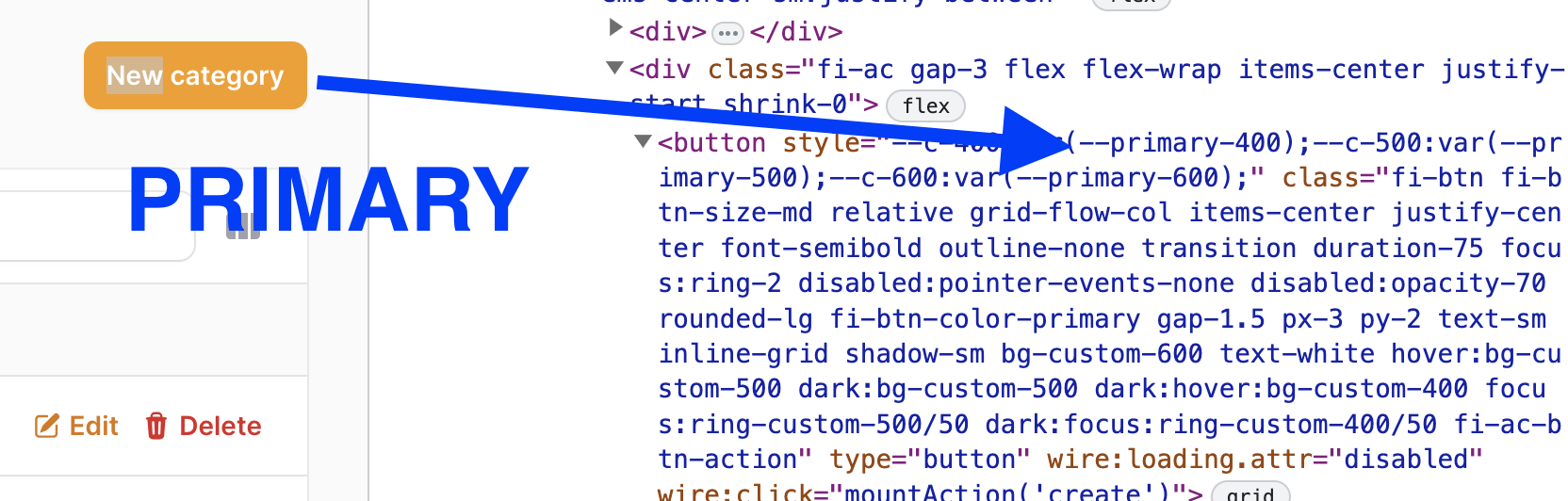
So, if you want to use a "success" style instead of a "primary" class, you can change it in one of the methods for specific components.
For example, in the...
" as it may introduce breaking changes " This is my biggest gripe about these amazing packages. Filament is a next level amazing bit of kit, but you do very much get locked into their way of doing stuff or be version locked. I'd love to be able to move things like the filter toggle next to the column toggle and have the filters open under that but before the header... but I'd have to update it every update cycle. Not worth the pain. It would be nightmarish to build that flexibility.
Well that and that many of them use tailwind without giving you a non tailwind version... It's a PITA for someone like me that works for a corpo that is super picky about their brand, but I understand and am off topic.
Bit of a rant... sorry. Awesome tutorial as always :)
It is a valid rant I would say. The problem indeed comes when you are working in a corpo that has strict way of doing things.
The best you can do at that point is simply create a new there (sounds easy but is not really that easy) and use whatever you want inside. But as that opens your hands - your corporation might not be happy with the choice, as, well, it's more work :) So it's hard to find the perfect balance in that situation
Is anyone aware of a way to change the default buttons on a resource? So, instead of seeing the button in the upper right saying 'NEW USER' it can be changed to 'NEW CLIENT' instead. The same with the default buttons for the 'CREATE" and "CREATE & CREATE ANOTHER' at the bottom. This would be per resource, not a global change that would affect all resources. Thanks in advance for any help regarding this.
To rename the Create action button, in your resource's list page change the create action to: Actions\CreateAction::make()->label('Custom label'),
Please assist and the npm run build keeps on failing. It will be apprecaited thank you.
npm ERR! code ELIFECYCLE npm ERR! errno 1 npm ERR! @ build:
vite buildnpm ERR! Exit status 1 npm ERR! npm ERR! Failed at the @ build script. npm ERR! This is probably not a problem with npm. There is likely additional logging output above.